Improving the readability of error messages
As a UX research intern at Google, I substantially improved the usability of error messages in Flutter by means of interviews with stakeholders, applications of visual design techniques in prototyping, online surveys (to do an unmoderated usability study!) and quantitative analysis.
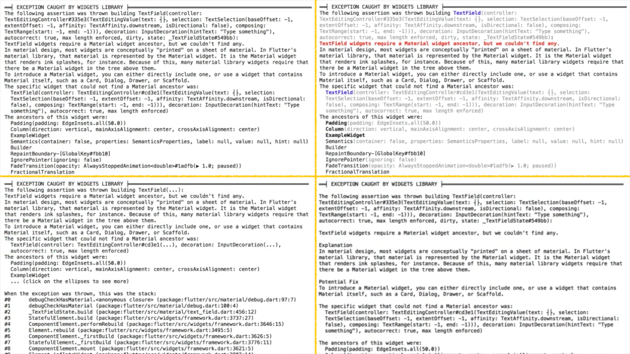
 The picture above shows three visual variations I created of an example error message. Going clockwise from the top-left, the first screenshot is of the original error message. The next is a variation with text formatting (color and boldface). The next has line spaces and subheadings for meaningful chunks of text. The last one has unnecessary content hidden behind ellipses (…).
I was mentored by Tao Dong, and we published an extended abstract at CHI 2019 (link to paper) discussing some of the work. Watch a 30-second summary below!